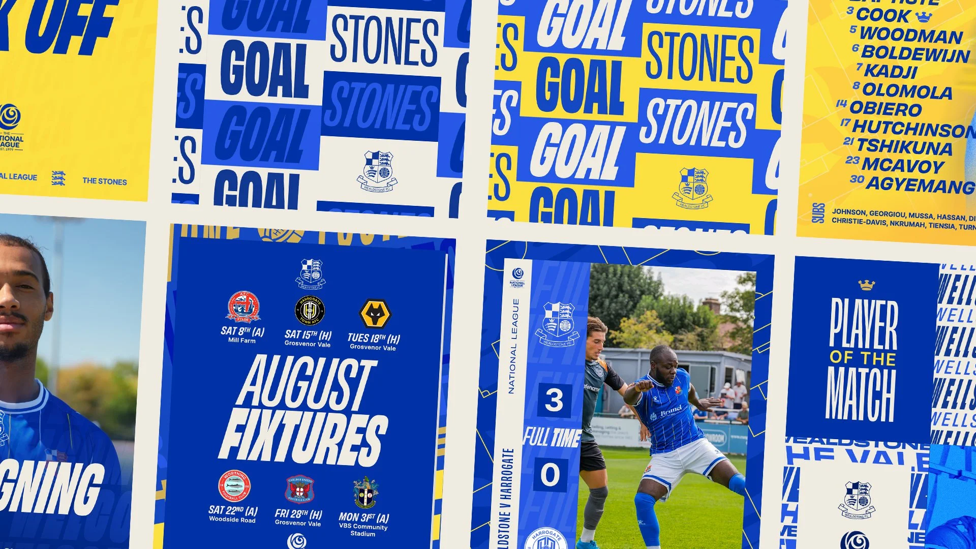
A SYSTEM BUILT FOR THE STAND, NOT THE STANDS
THE BRIEF
Wealdstone FC needed a social template system that could carry them through a National League season without leaning on the one thing most clubs take for granted: consistent, high-quality matchday photography.
What they had instead was a rapidly growing, increasingly young fanbase, thanks to a hugely popular discounted youth season ticket, and a stadium where nearly the whole crowd gathers behind one goal. Brilliant for atmosphere. Not so brilliant if your entire design system depends on "a packed stadium" shot from every angle.
DISCOVERY
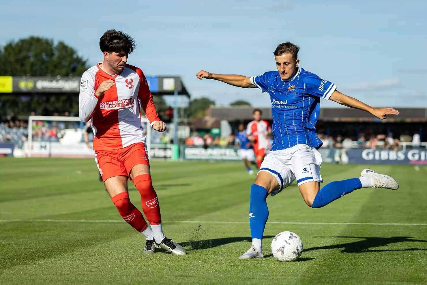
As a Tier 5 club, Wealdstone doesn't have a Getty account or a matchday photographer on retainer. What they have is good-faith photography from whoever's around with a camera, which meant any system we built had to survive without ever depending on a specific shot being available.
That single constraint shaped everything that followed. Rather than design something that looked great in the pitch deck and fell apart the first time the "perfect" photo wasn't there, we needed a system that didn't lean on photography to do the heavy lifting at all.
STRATEGY
The brief settled into a clear idea: build identity through graphic system, not photography. If the visual language could carry itself, typography, colour, iconography, doing the work a big photo budget usually does elsewhere, the club would have something genuinely resilient. A system that works when the photography's great, and still works when it isn't.
THE CREST
Wealdstone's crest already had everything the system needed, it just hadn't been used that way before. We pulled it apart, literally: the football, the three swords, the three lions, each element lifted out of the shield and rebuilt as a clean, modern icon. Used consistently across the templates, that icon set became a visual signature that didn't depend on a single photograph existing.

DESIGN DIRECTION
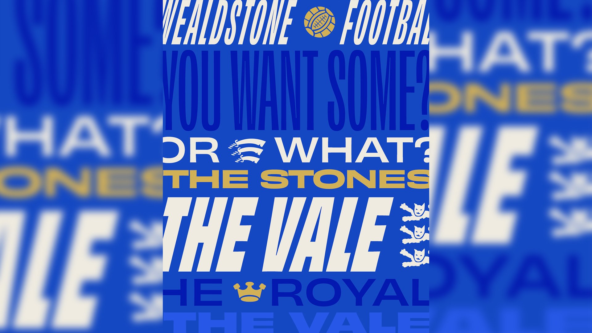
We built a colour palette rooted directly in the club's own identity, then turned to typography as the system's real backbone. We looked at typography-led branding systems, youth culture, and esports aesthetics, territory that spoke directly to the younger fanbase now filling the ground, and built a custom typographic system out of the club's own nicknames, terrace chants, and the ground's name itself. Strong enough, on its own, to carry a post with no photography at all.
THE WORK
What came out the other end looks nothing like the rest of the division: sharp, modern, and unmistakably Wealdstone, whether or not the matchday photography that week happened to be any good. A system built for a fast-growing young fanbase, without alienating the supporters who've been part of the club for years.
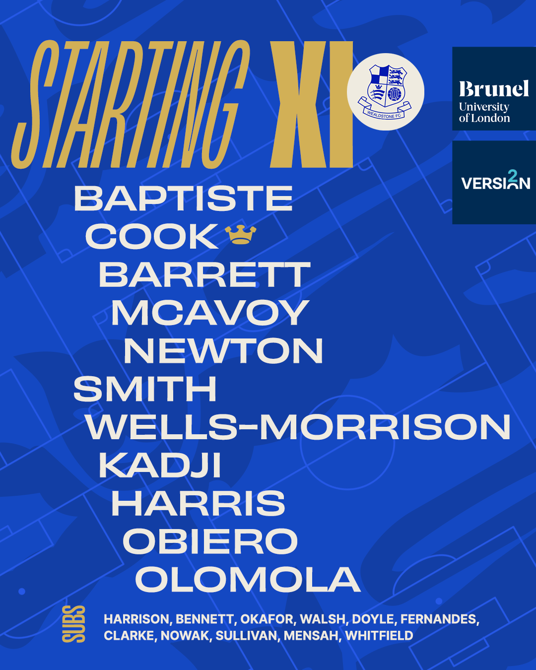
Our AI generated mock-up
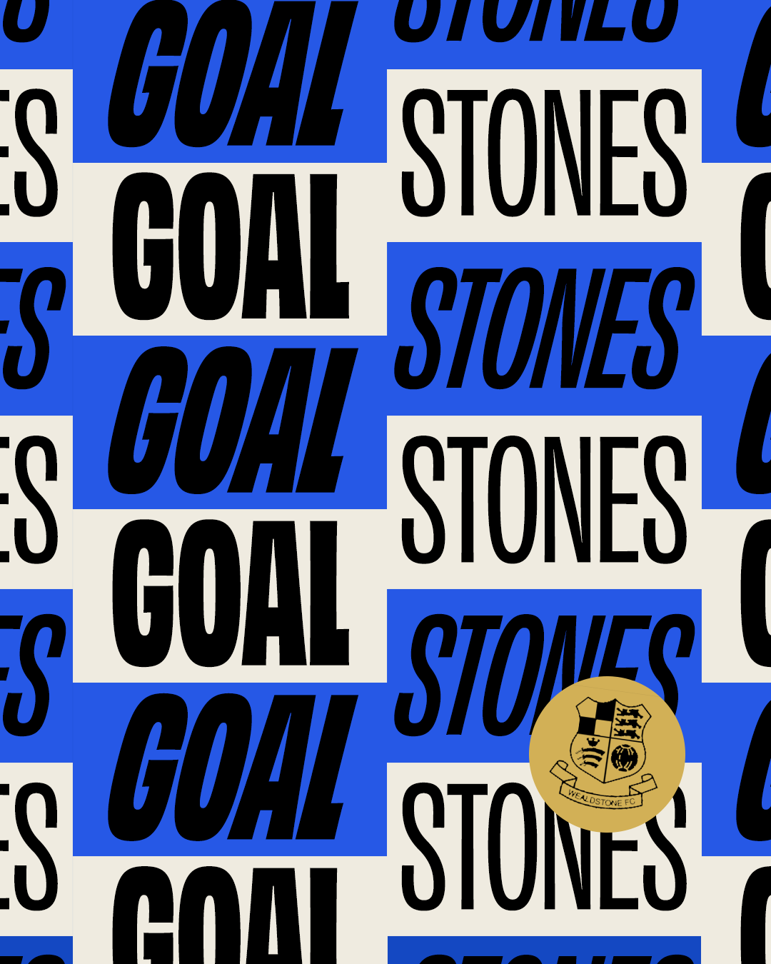
Actual signing graphic from @Pompey’s Instagram
THE OUTCOME
Wealdstone came away with a social identity that isn't held hostage by circumstance, no missed shot, no inconsistent lighting, no gap in the photography can take it off-brand. The crest, the typography, and the colour system carry the identity on their own, every single week, home or away, regardless of what's actually been captured pitch-side that day.
A good design system doesn't need perfect conditions. It needs to work in the conditions you've actually got.
Interested in a template system built around your club's identity? Get in touch at hello@playbook-studios.com.