

TEMPLATES INSPIRED BY THE CITY
THE BRIEF
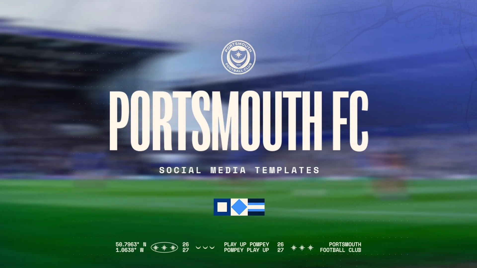
Portsmouth FC needed a social system that could carry a full season of content without losing consistency or character, and without losing the sense of place that makes Pompey, Pompey.
What they didn't want was noise.
They wanted something considered, something that gave the football and the photography room to breathe, and something that felt unmistakably theirs.
DISCOVERY
We started with conversation rather than colour palettes.
Our discovery calls were about understanding how the club talks to its supporters, what the match day rhythm looks like across a week, and where the day-to-day realities bite, who's building graphics, how fast they need to turn them around, and where things get messy when fixtures come thick and fast.
We turned those notes (recorded by ‘Fathom’, an AI meeting recorder that does a great job and is totally free!) into a clear tick list shared across our team, so nothing raised in the room quietly slipped through the gaps.
STRATEGY
The brief settled into a single idea: Portsmouth needed a system, not a folder of one-off designs. A set of graphics solves this week's problem, but a system solves a full season's, so we built around repeatability and structural clarity.
The aim was a framework a small in-house team could pick up and run with, week after week, without needing us in the room every time.
THE CITY
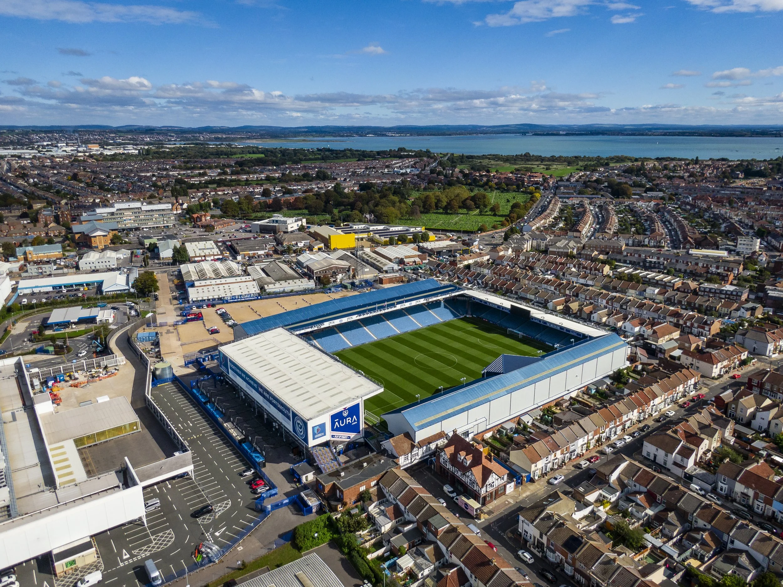
Portsmouth is a naval city and always has been, its history written into its dockyards, its warships, and the grey-blue of the Solent. Rather than skim the surface of that heritage, we embraced in it.
The dark navy that anchors the system symbolises the deep water the city has lived alongside for generations, and the detailing throughout carries quiet maritime cues, the sort a supporter feels before they consciously notice. Done well, heritage doesn't announce itself. It just makes everything feel like it belongs.

DESIGN DIRECTION
We developed three distinct concepts and put them in front of the club, each taking the minimal, photo-led navy foundation in a slightly different direction. The feedback was spread across all three, a layout instinct in one, a detailing approach in another, so the final look became a considered mish-mash of the strongest elements from each, refined until it read as one deliberate language.
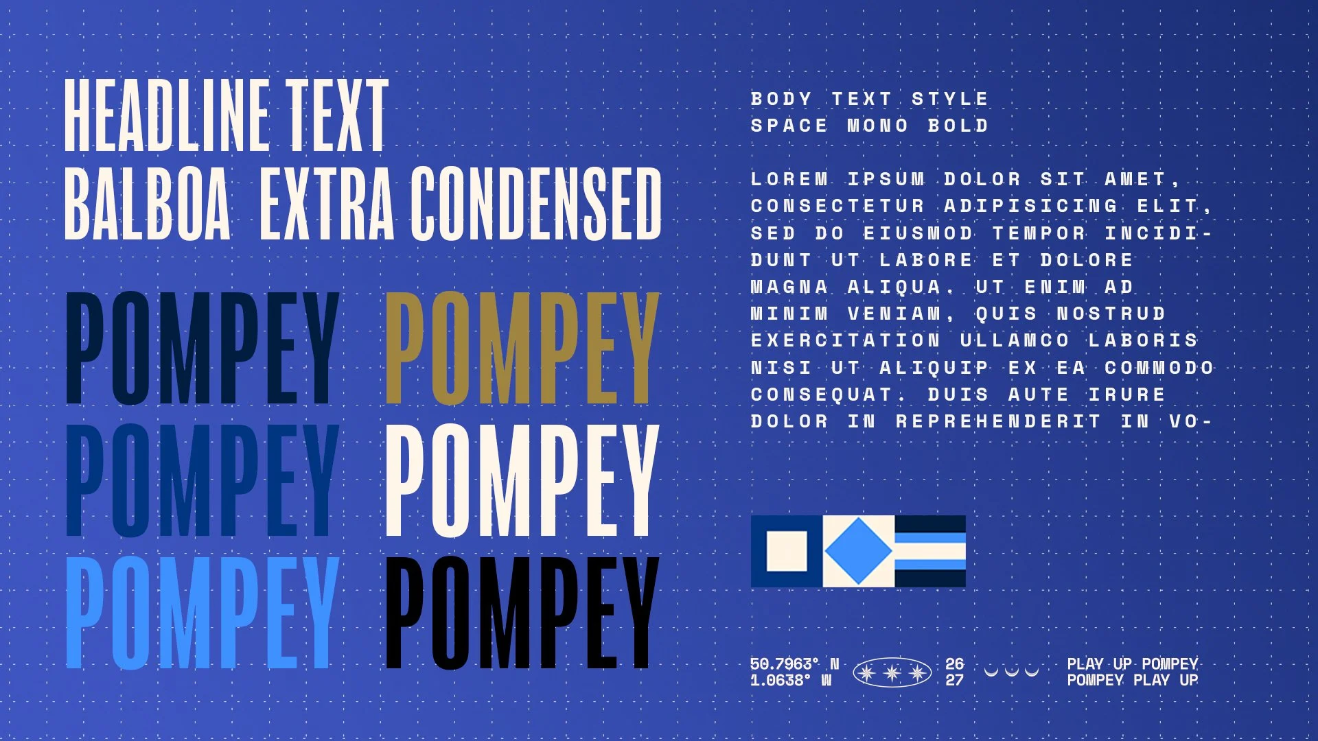
The typography is where the naval thinking really earns its place:
Headlines use a modern, condensed, solid typeface inspired by the stencilled lettering stamped across shipping containers in the docks, giving the big moments an industrial weight suited to a working naval city.
Smaller text uses Space Mono, a typewriter-style monospace that echoes the plotted typography of old naval maps and charts.
Woven throughout, we used the naval signal alphabet, the maritime flags used to communicate at sea, as a recurring motif.
ART DIRECTION
This is where the project became bigger than a design job. Using AI (via Aptelligence), we mocked up studio shots that showed the club exactly the kind of photography the system was built to frame, and those became the style direction for their media day. We suggested two props that tie straight back to the city's shipping history: a wooden barrel for players to sit on, and a bespoke flag made from the three naval signal symbols that spell PFC, to be draped around players for signing shoots and kit launches. The club implemented the direction as we laid it out. We weren't just doing design, we were shaping how Portsmouth looks in front of a camera.

Our AI generated mock-up
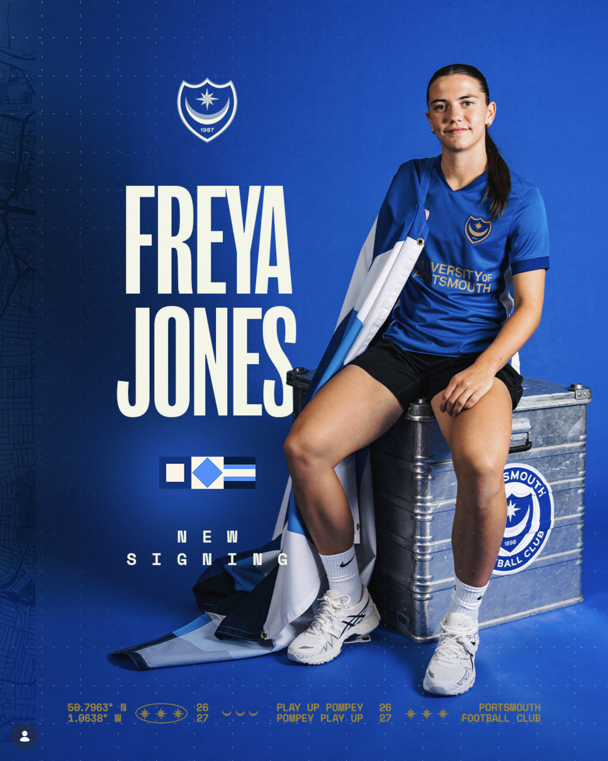
Actual signing graphic from @Pompey’s Instagram
THE WORK
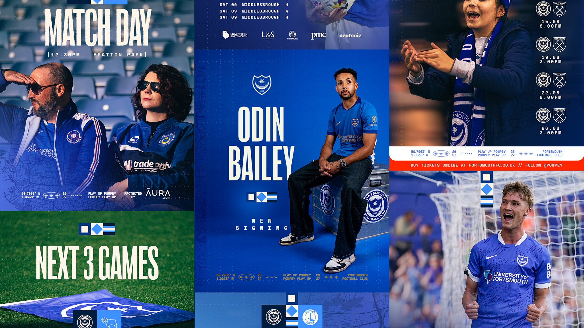
The project landed as a single, coherent fifteen-template suite, every template sharing the same structural DNA so the whole feed reads as one identity. From Starting XI’s, to Goals, to Subs and Quotes, everything is covered.
Alongside the templates we hand-crafted the club's new signing announcement to set a benchmark they could replicate, and generated a set of YouTube thumbnails to carry the same consistency across to their video content. Every template was delivered in 4x5, 9x16 and 1x1, and in 16x9 where required, so the system works everywhere Portsmouth shows up online.
THE OUTCOME
Portsmouth FC came away with a system that moves fast enough for a busy in-house team, stays consistent across a full season, and feels genuinely, specifically like Portsmouth.
Beyond that, they have a clear art direction for their media days, props and styling the club has actually put into practice, and a creative strategy for how the brand shows up across its digital landscape.
A good design system isn't just tidy. It belongs somewhere.
This one belongs to Portsmouth.
Interested in a template system built around your club's identity? Get in touch at hello@playbook-studios.com.